Harper Rose is a boutique jewellery brand blending timeless design with modern femininity. We crafted a brand identity that feels refined, romantic, and effortlessly elevated — the perfect match for their
delicate pieces.
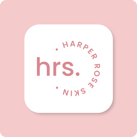
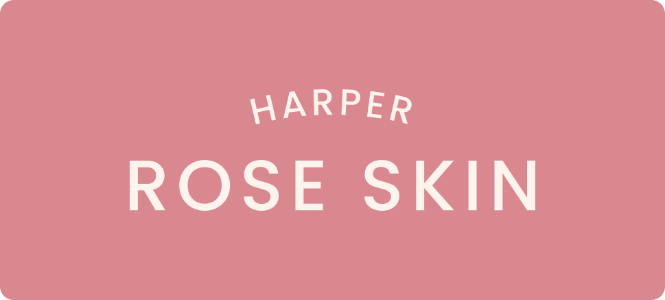
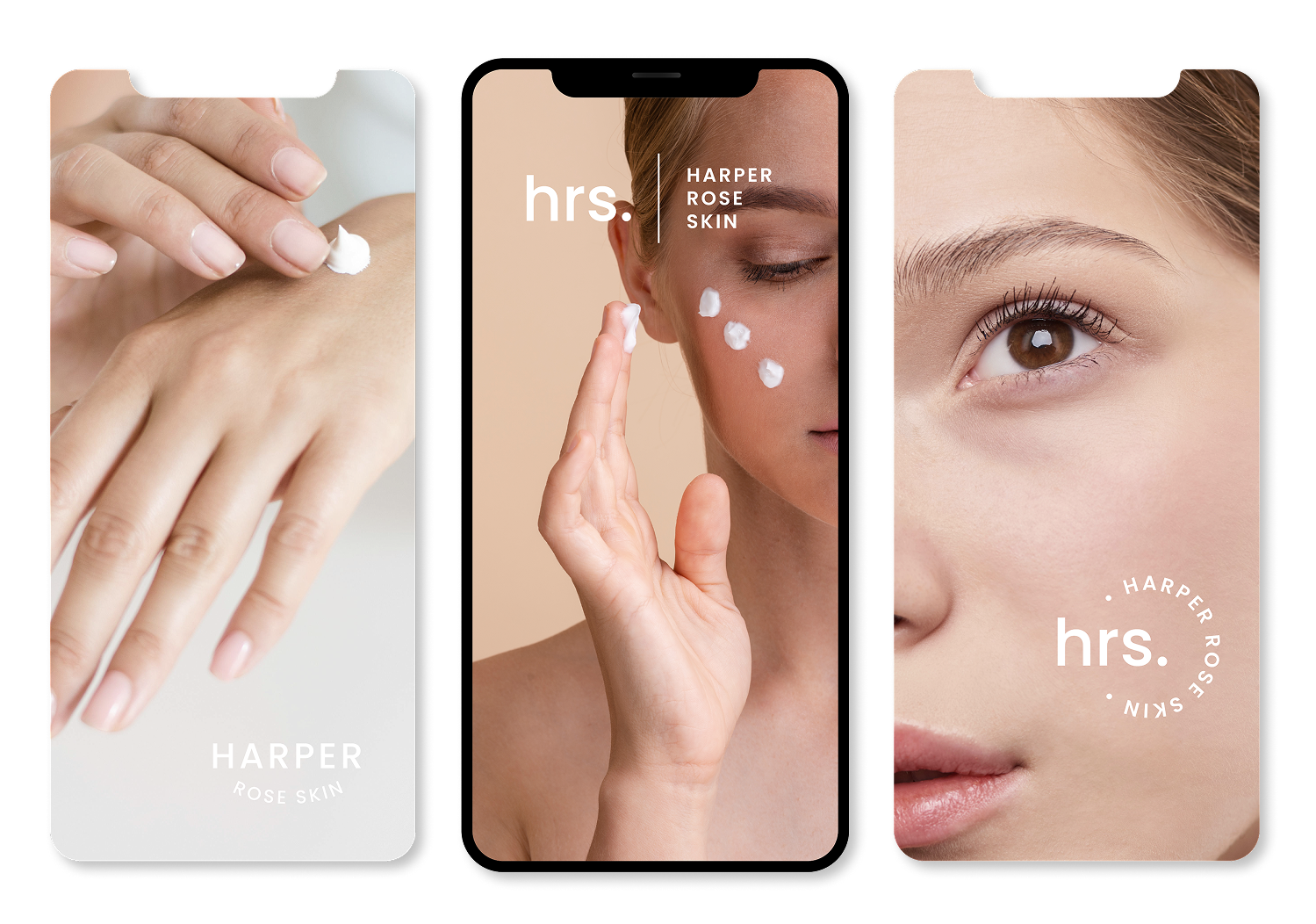
Harper Rose is a clean beauty brand that blends science-backed formulas with gentle self-care rituals. We partnered with them to shape a refined, minimal brand identity that speaks to calm confidence and modern femininity.
BEAUTY THAT BREATHES
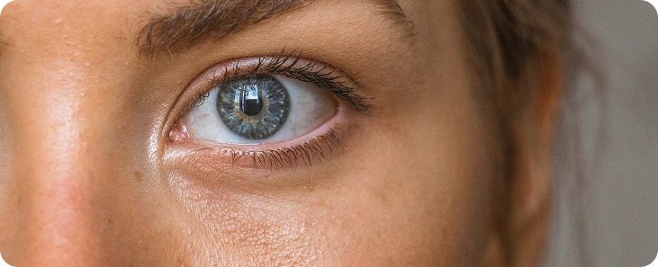
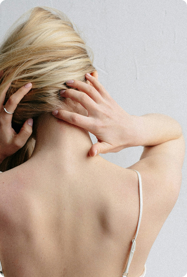
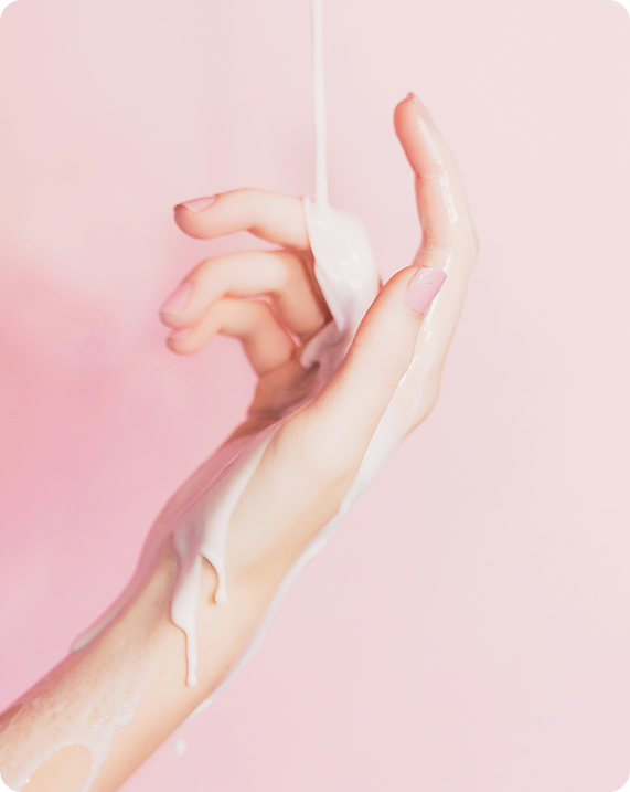
The goal wasn’t flashy — it was fresh. Harper Rose needed a look that felt soft, nourishing, and rooted in care. We designed a brand that breathes: light, clean layouts, botanical touches, and understated elegance.
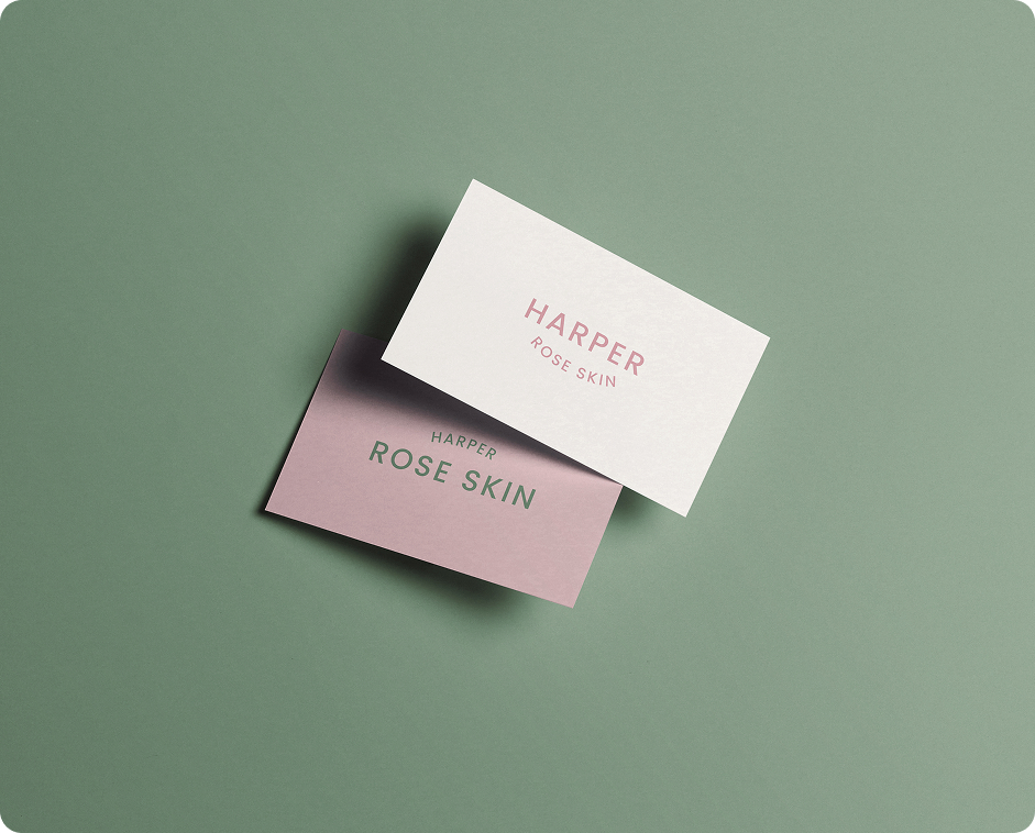
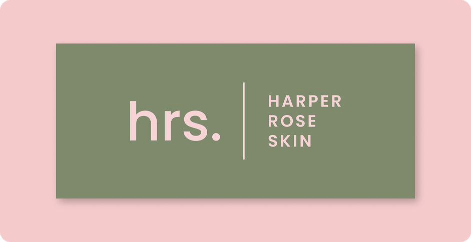
A Complete Identity
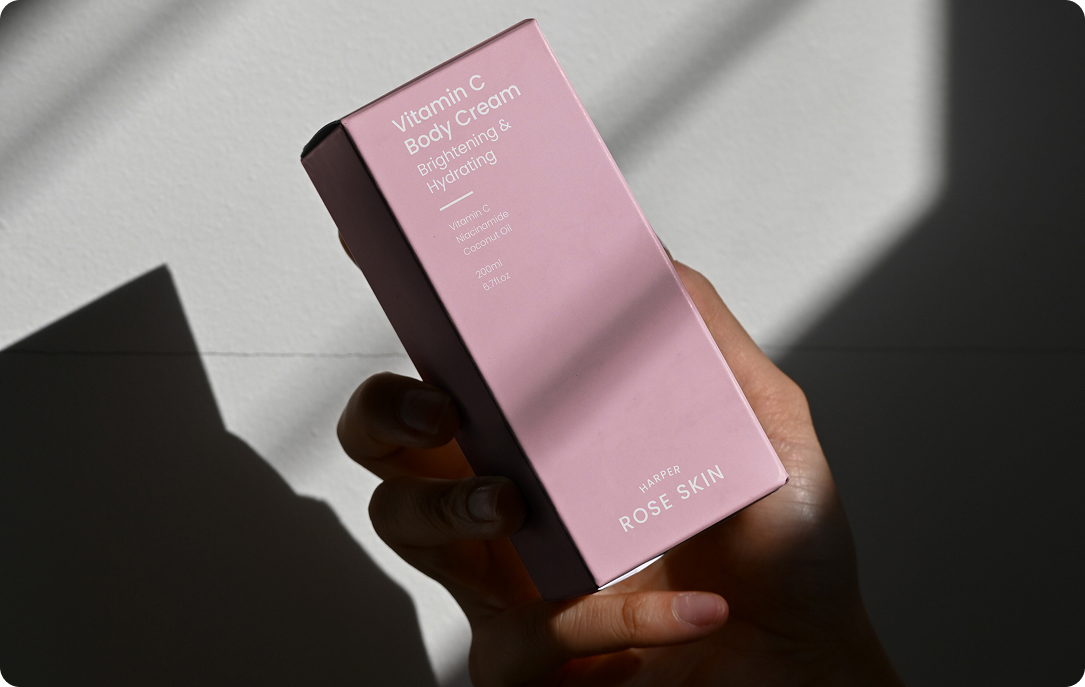
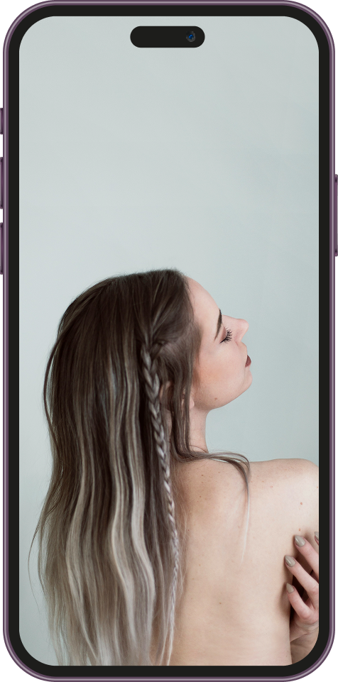
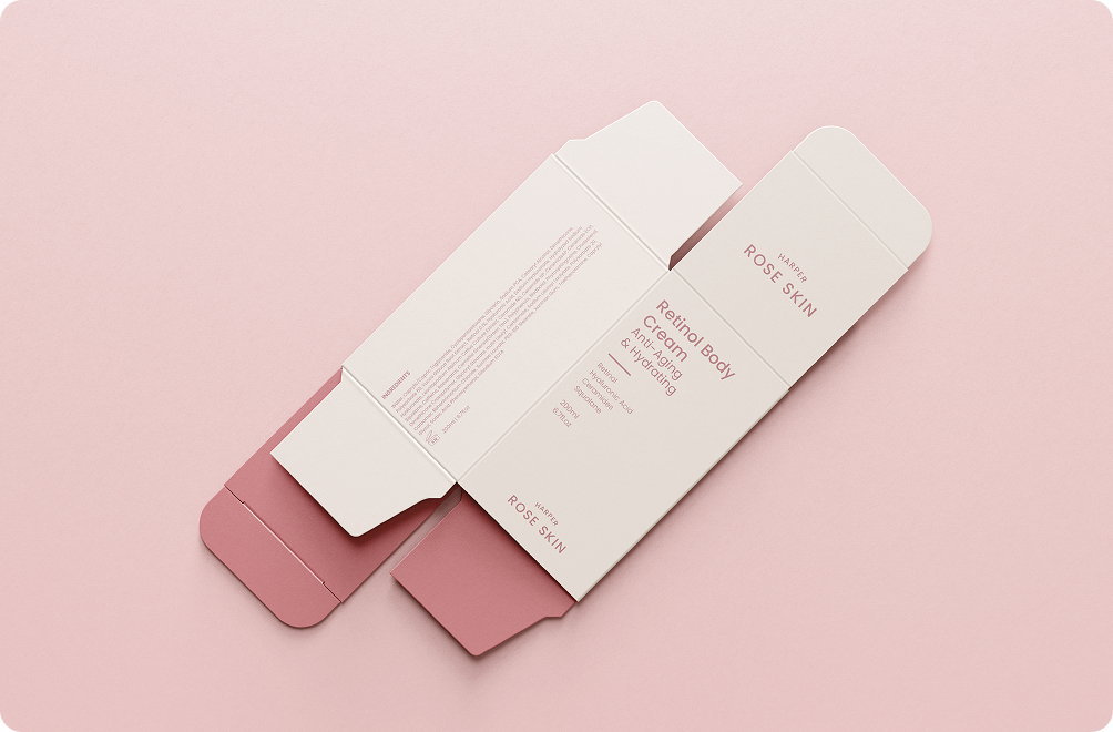
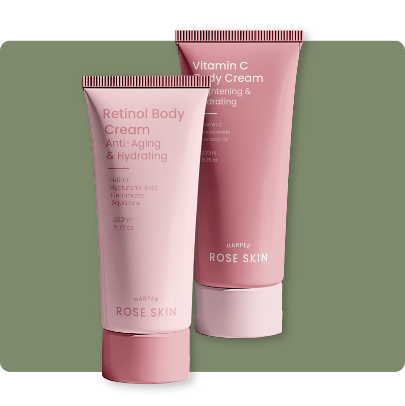
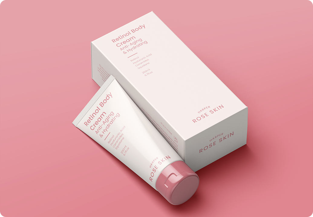
From logo to labels to launch-day content, we created a full suite of assets that helped Harper Rose confidently enter the skincare space. Every touchpoint reflects the brand’s philosophy of balance, intention, and glow.
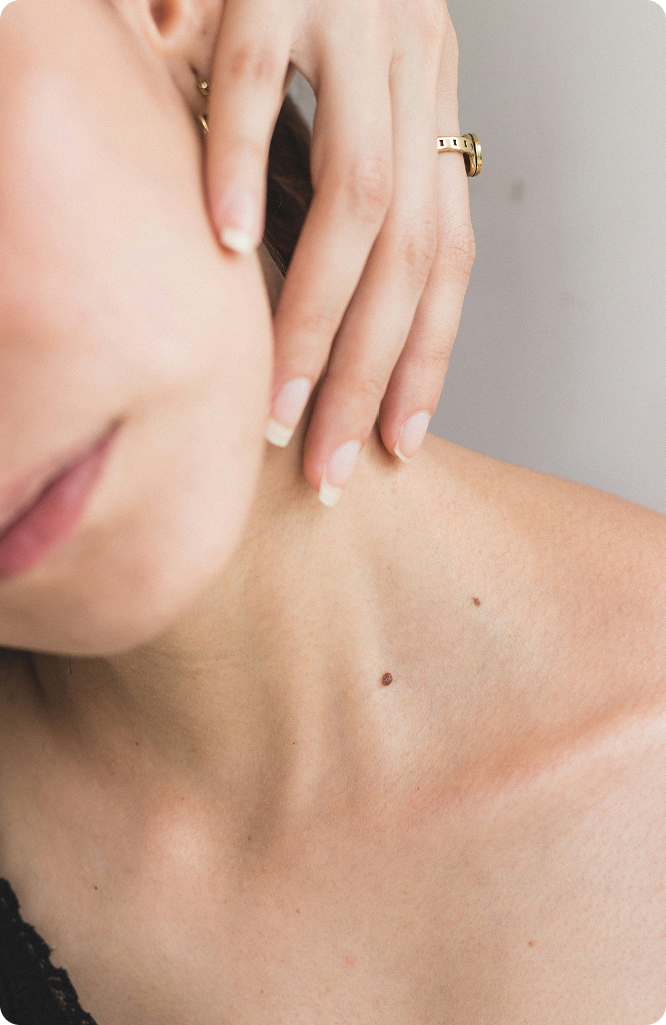
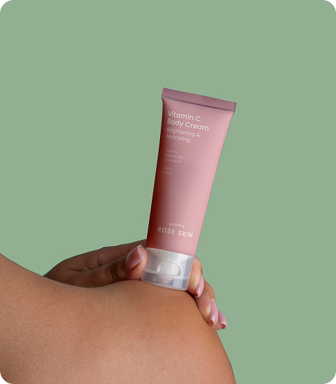
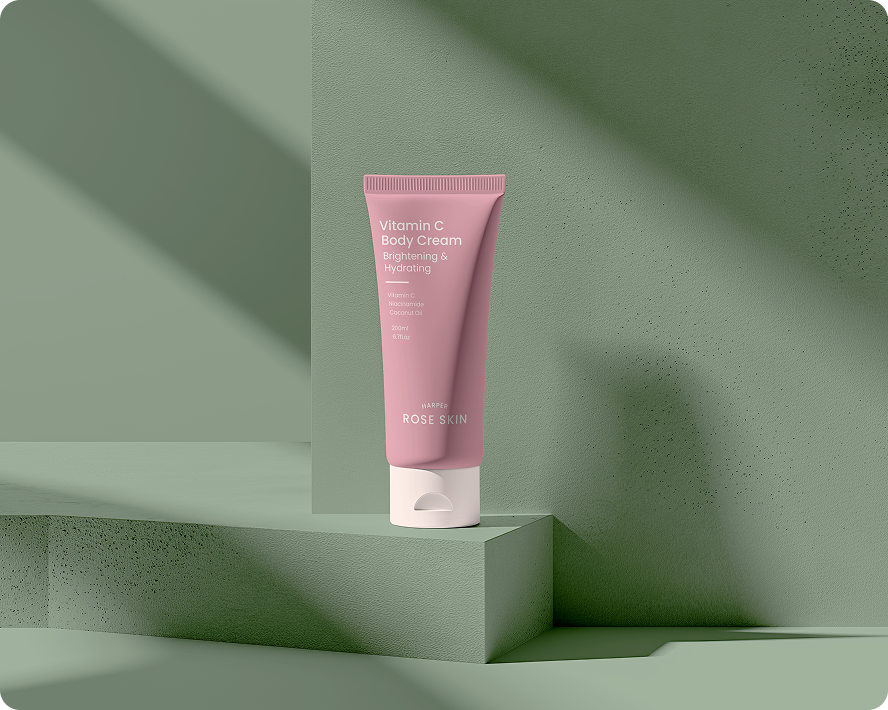
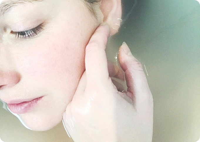
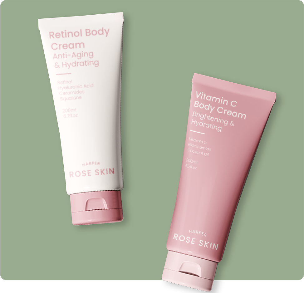
We crafted textures, icons, and imagery direction that reflect the skincare experience — smooth, minimal, comforting. Our mockups show the products in warm, natural light, styled simply to let the formulas shine.
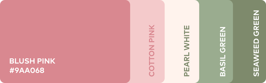
A Ritual-Ready Palette
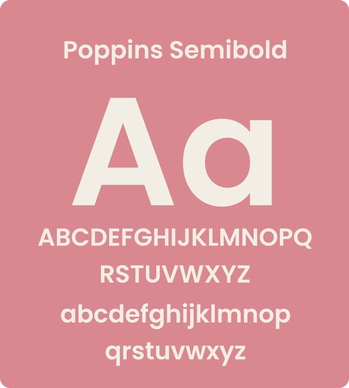
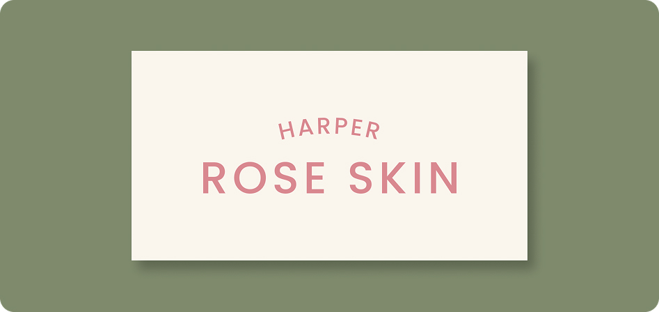
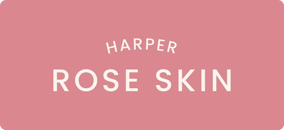
We built a color story around soft neutrals, muted pinks, and creamy whites — calm, modern, and gender-inclusive. Paired with elegant serif type and generous white space, the identity feels soothing and aspirational.
A Gentle Voice
We supported Harper Rose in shaping their tone of voice — gentle, informed, and empowering. Copy was designed to educate without overwhelm, speaking with warmth and clarity across packaging and digital.
Ready to Create Something Extraordinary?
If you’d like to see more examples or discuss how we can bring your vision to life, Book a Discovery Call and let’s get started!